6dicasa - logo design
|
Transparency
ITA | ENG |
"In good times, people want to advertise; in bad times, they have to."Bruce Barton
"In good times, people want to advertise; in bad times, they have to."
Bruce Barton
6dicasa - logo design
CATEGORY: Graphics
YEAR: 2024
6dicasa is an initiative born by six entrepreneurs specialized in the redevelopment and renovation of houses from the 1960s.It offers solutions to improve energy efficiency, aesthetics and value of housing through targeted interventions, which can be financed with monthly instalments.The team is made up of building professionals with decades of experience.
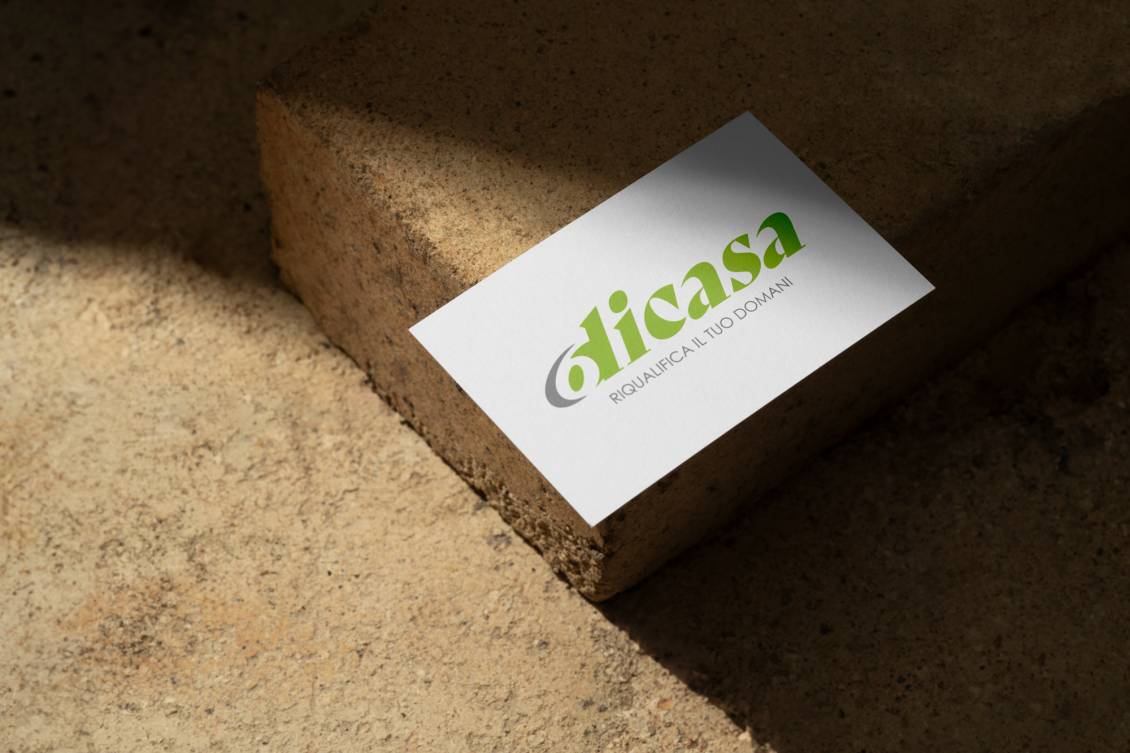
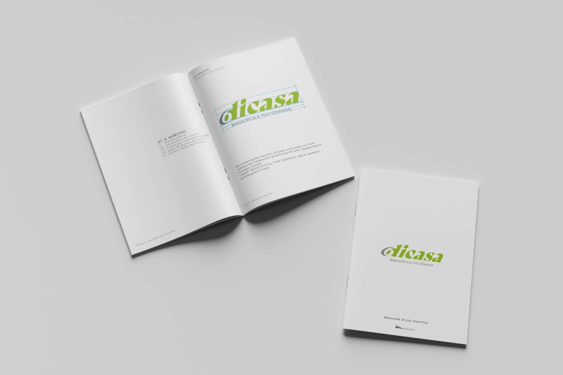
Our firm was commissioned to design the logo.Our solution was to play on the number 6 and its perception in the negative space that is created in the letter "d".
So the number "6", representing the six professionals involved, is shown as an entity present but existing only through this collaboration.The colors used have a clear reference to "green" and energy efficiency, core and objective of this operation.


Do you like the way we worked?
Make an appointment for a non-binding consultation now.
Schedule your consultation now!
6dicasa - logo design
CATEGORY: Graphics
YEAR: 2024
YEAR: 2024
6dicasa is an initiative born by six entrepreneurs specialized in the redevelopment and renovation of houses from the 1960s.
It offers solutions to improve energy efficiency, aesthetics and value of housing through targeted interventions, which can be financed with monthly instalments.
The team is made up of building professionals with decades of experience.
Our firm was commissioned to design the logo.
Our solution was to play on the number 6 and its perception in the negative space that is created in the letter "d".
So the number "6", representing the six professionals involved, is shown as an entity present but existing only through this collaboration.
The colors used have a clear reference to "green" and energy efficiency, core and objective of this operation.