|
Transparency
ITA | ENG |
"In good times, people want to advertise; in bad times, they have to."Bruce Barton
"In good times, people want to advertise; in bad times, they have to."
Bruce Barton
B27 STUDIO TECNICO ASSOCIATO - Logo design
CATEGORY: Graphics
YEAR: 2024
Logo design project created for B27 STUDIO TECNICO ASSOCIATO.
The first phase of the brand ideation was the choice of the name that had to identify a very specific image: that of a technical design studio, and be able to tell a story.From this reflection was born "B27", acronym of Barra number 27 (made in 1889 it was the first international standard prototype of the length of 1 meter).
The first phase of the brand ideation was the choice of the name that had to identify a very specific image: that of a technical design studio, and be able to tell a story.From this reflection was born "B27", acronym of Barra number 27 (made in 1889 it was the first international standard prototype of the length of 1 meter).

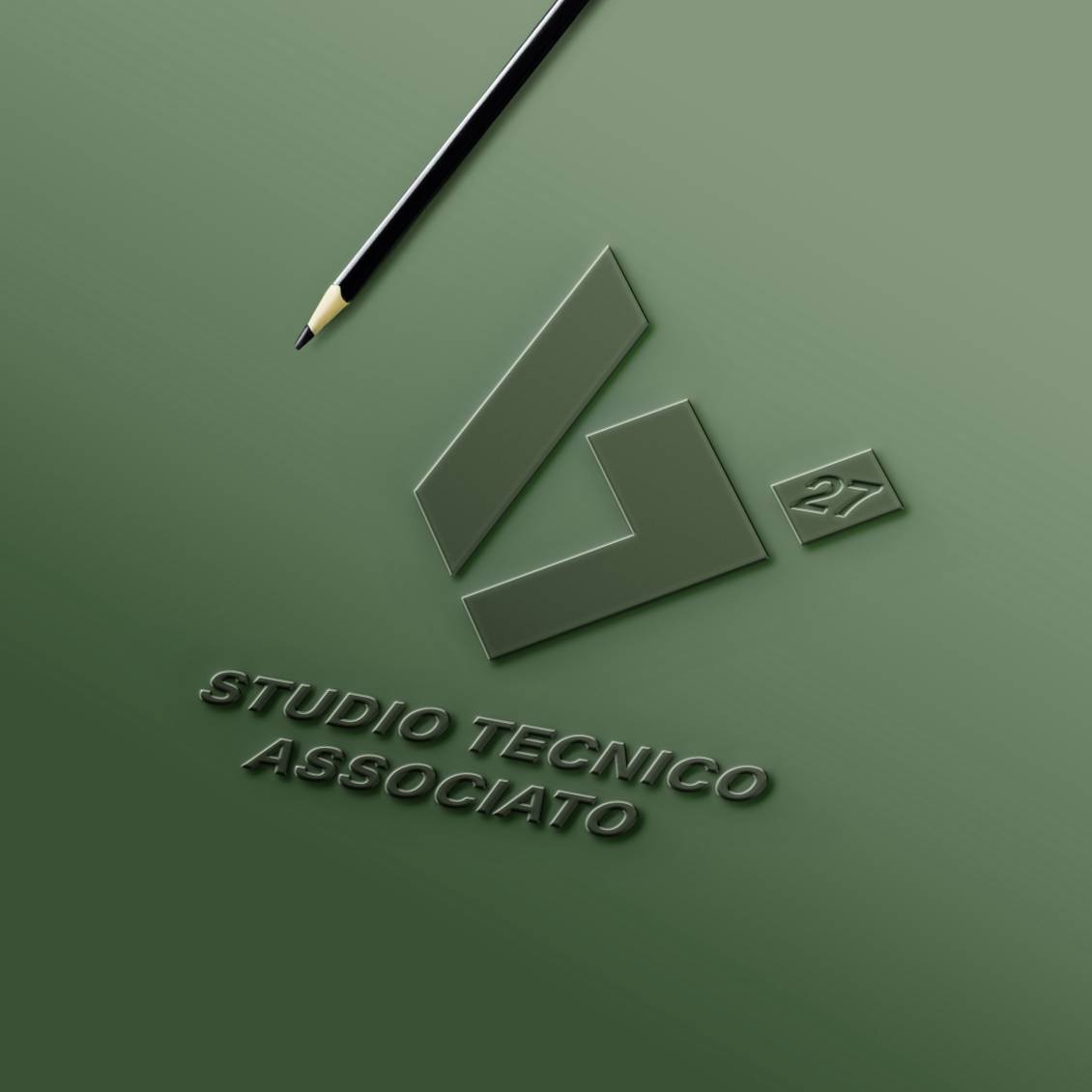
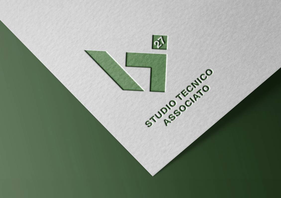
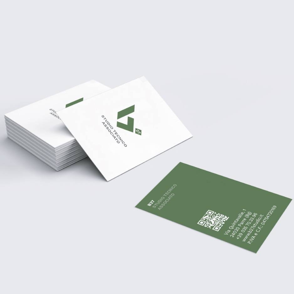
Subsequently we designed the actual brand, giving life to a pictogram - also usable on its own - representing the stylized letter B using elements with inclinations of 90° and 45°, always recalling the world of the studio, made of technique and precision.


Green was chosen as the institutional color, a shade that immediately evokes the concept of nature and is a symbol of stability, growth and balance.
Do you like the way we worked?
Make an appointment for a non-binding consultation now.
Schedule your consultation now!
BACK TO TOP
B27 STUDIO TECNICO ASSOCIATO - Logo design
CATEGORY: Graphics
YEAR: 2024
YEAR: 2024
Logo design project created for B27 STUDIO TECNICO ASSOCIATO.
The first phase of the brand ideation was the choice of the name that had to identify a very specific image: that of a technical design studio, and be able to tell a story.
From this reflection was born "B27", acronym of Barra number 27 (made in 1889 it was the first international standard prototype of the length of 1 meter).
Subsequently we designed the actual brand, giving life to a pictogram - also usable on its own - representing the stylized letter B using elements with inclinations of 90° and 45°, always recalling the world of the studio, made of technique and precision.
Green was chosen as the institutional color, a shade that immediately evokes the concept of nature and is a symbol of stability, growth and balance.
OTHER PROJECTS FOR THIS CLIENT
