|
Menu |
|
|
ITA ENG |

|
|
Transparency
ITA | ENG |


"In good times, people want to advertise; in bad times, they have to."Bruce Barton
"In good times, people want to advertise; in bad times, they have to."
Bruce Barton
 Back
Backda Bramante Pizzeria - restyling logo
CATEGORY: Graphics
YEAR: 2024
The historic "da Bramante pizzeria" business in Castione della Presolana, after the renovation of the external premises again by our studio, needed a new image that best embodied its identity.
The result is a very fresh brand that has an extremely modern and minimal language, communicating through simple lines the "good vibes" that can be felt inside the venue.
The result is a very fresh brand that has an extremely modern and minimal language, communicating through simple lines the "good vibes" that can be felt inside the venue.
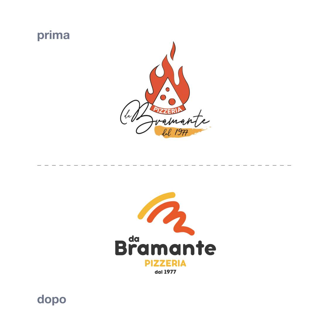
The historic brand was chaotic due to the arrangement of the elements that made it up. The font used for the logo was then difficult to read, especially when the logo was used in small dimensions, this made it unsuitable for use on modern means of communication such as websites and social networks.
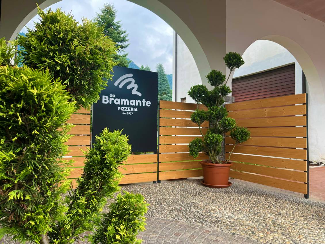
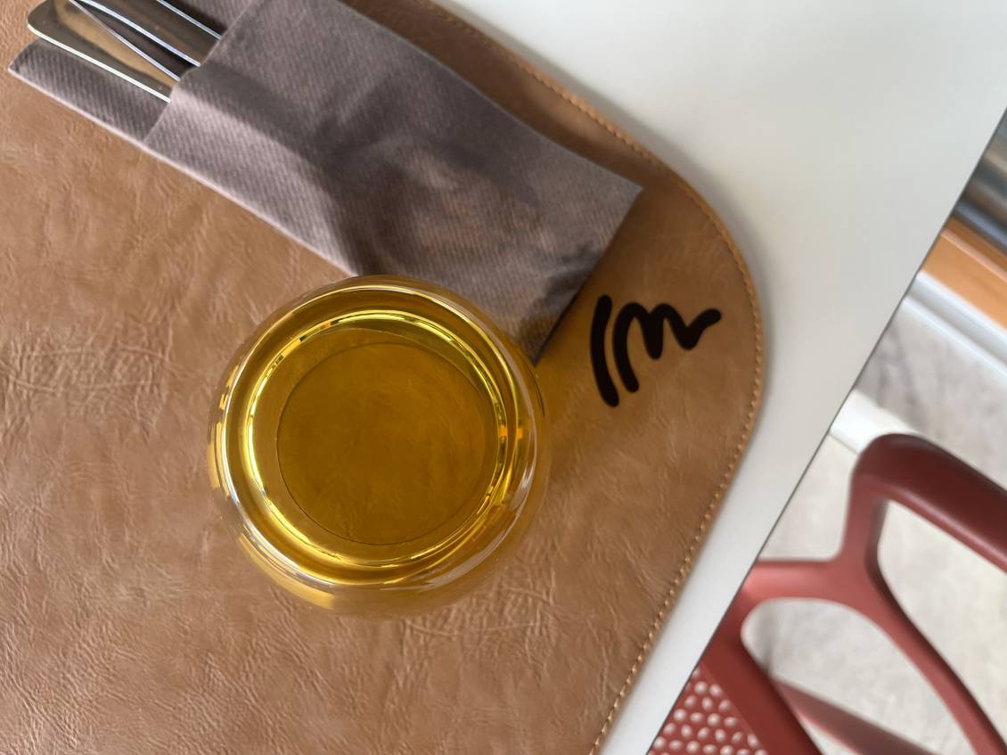
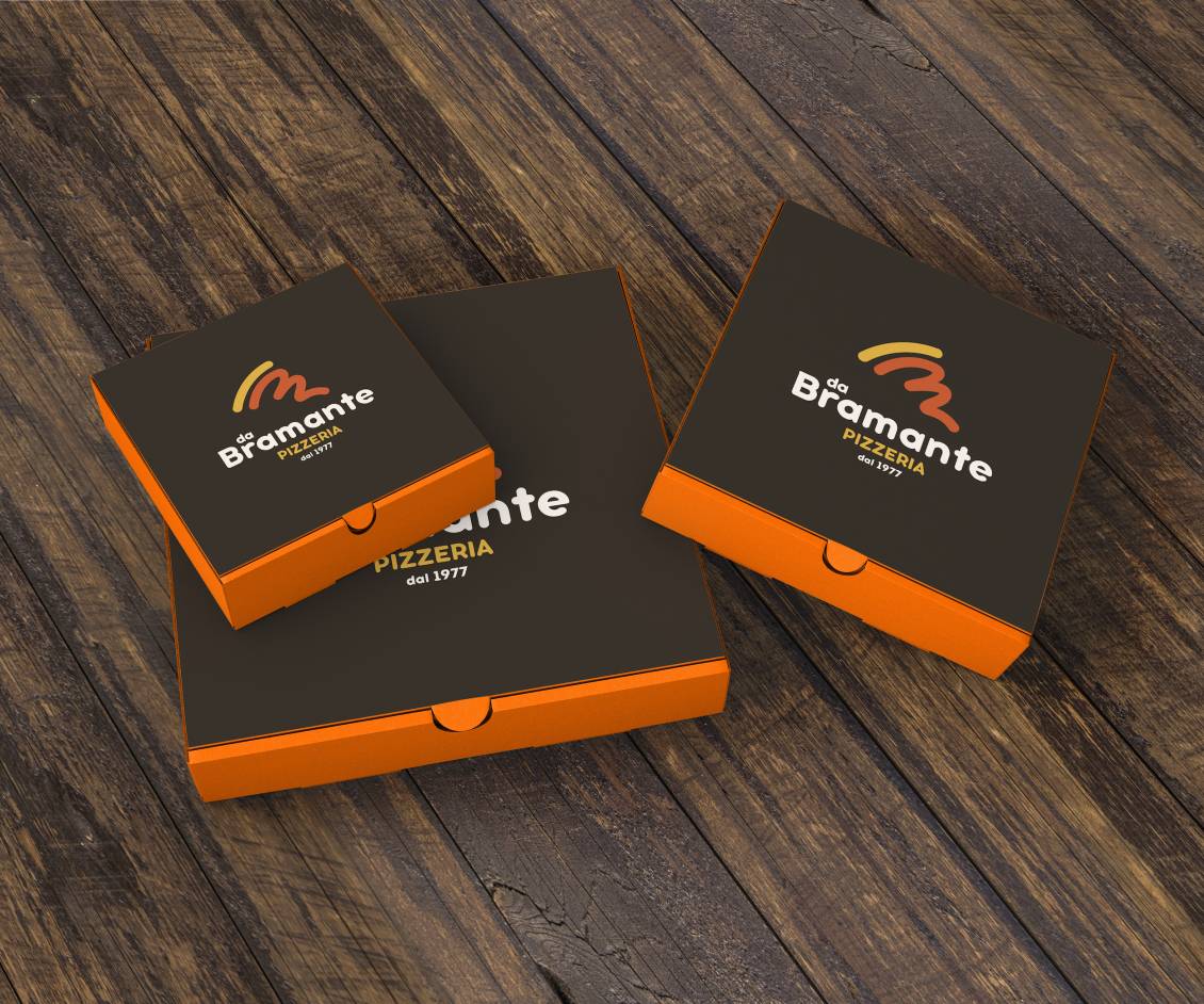
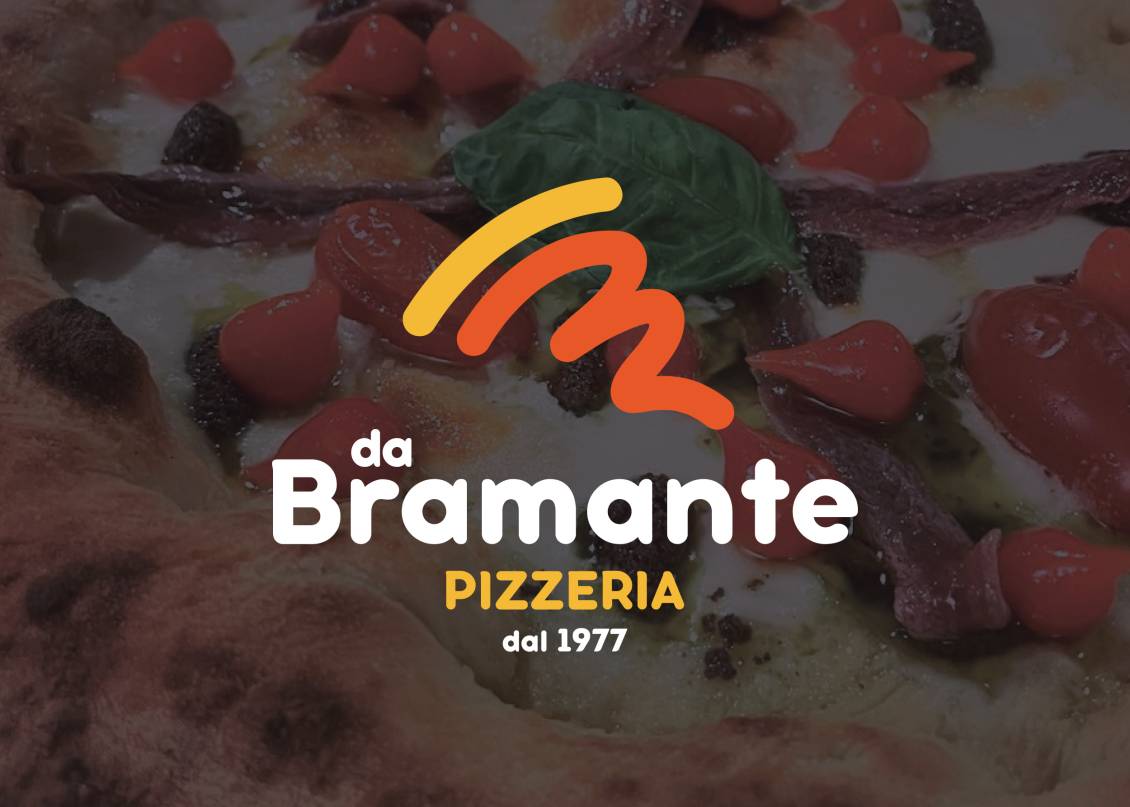
The new brand was born from the reinterpretation of the pictogram in a modern key: a slice of pizza stylized using two simple graphic signs.The pictogram also draws a letter "B" in orange. The chosen font is much more modern and immediately readable.
The institutional colors have been maintained in full, being absolutely suitable for the type of activity and adhering to the corporate tone of voice.
Do you like the way we worked?
Make an appointment for a non-binding consultation now.
Schedule your consultation now!
BACK TO TOP
da Bramante Pizzeria - restyling logo
CATEGORY: Graphics
YEAR: 2024
YEAR: 2024
The historic "da Bramante pizzeria" business in Castione della Presolana, after the renovation of the external premises again by our studio, needed a new image that best embodied its identity.
The result is a very fresh brand that has an extremely modern and minimal language, communicating through simple lines the "good vibes" that can be felt inside the venue.
The historic brand was chaotic due to the arrangement of the elements that made it up. The font used for the logo was then difficult to read, especially when the logo was used in small dimensions, this made it unsuitable for use on modern means of communication such as websites and social networks.
The new brand was born from the reinterpretation of the pictogram in a modern key: a slice of pizza stylized using two simple graphic signs.
The pictogram also draws a letter "B" in orange. The chosen font is much more modern and immediately readable.
The institutional colors have been maintained in full, being absolutely suitable for the type of activity and adhering to the corporate tone of voice.
OTHER PROJECTS FOR THIS CLIENT

 |
 |

|
Change your cookies preferences |
| Active cookies settings: |
| · Essential cookies: |

|
| · Analytic cookies of third parties with anonimous IP: |
|
| · Profiling cookies of third parties: |

|
Active cookies settings:
| · Essential cookies: |
|
| · Analytic cookies of third parties with anonimous IP: |
|
| · Profiling cookies of third parties: |
|
Use of the cookies
|
||||||
|
||||||
| Only technical cookies |

|
| Accept all cookies |

|
|
|
|
| Cancel change |
|
| Confirm change |
|
| Accept selected |
|
| Close choice options |

|
| Choice options |
|