|
Transparency
ITA | ENG |
"In good times, people want to advertise; in bad times, they have to."Bruce Barton
"In good times, people want to advertise; in bad times, they have to."
Bruce Barton
Hote Libia - logo restyling
CATEGORY: Graphics
YEAR: 2024
The Hotel Libia in Fino del Monte has a long history to tell, which began in 1912. The hotel's logo was almost as old as the accommodation facility and therefore needed a radical restyling operation.
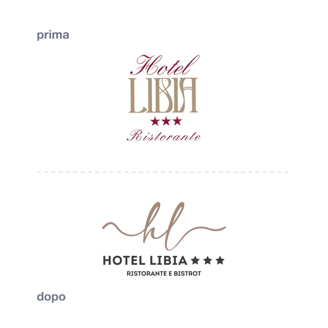
The historic brand was outdated and no longer in step with the times and modern uses. The logo font was difficult to read due to the decorations inside the letters and their shape, especially when used in small dimensions.
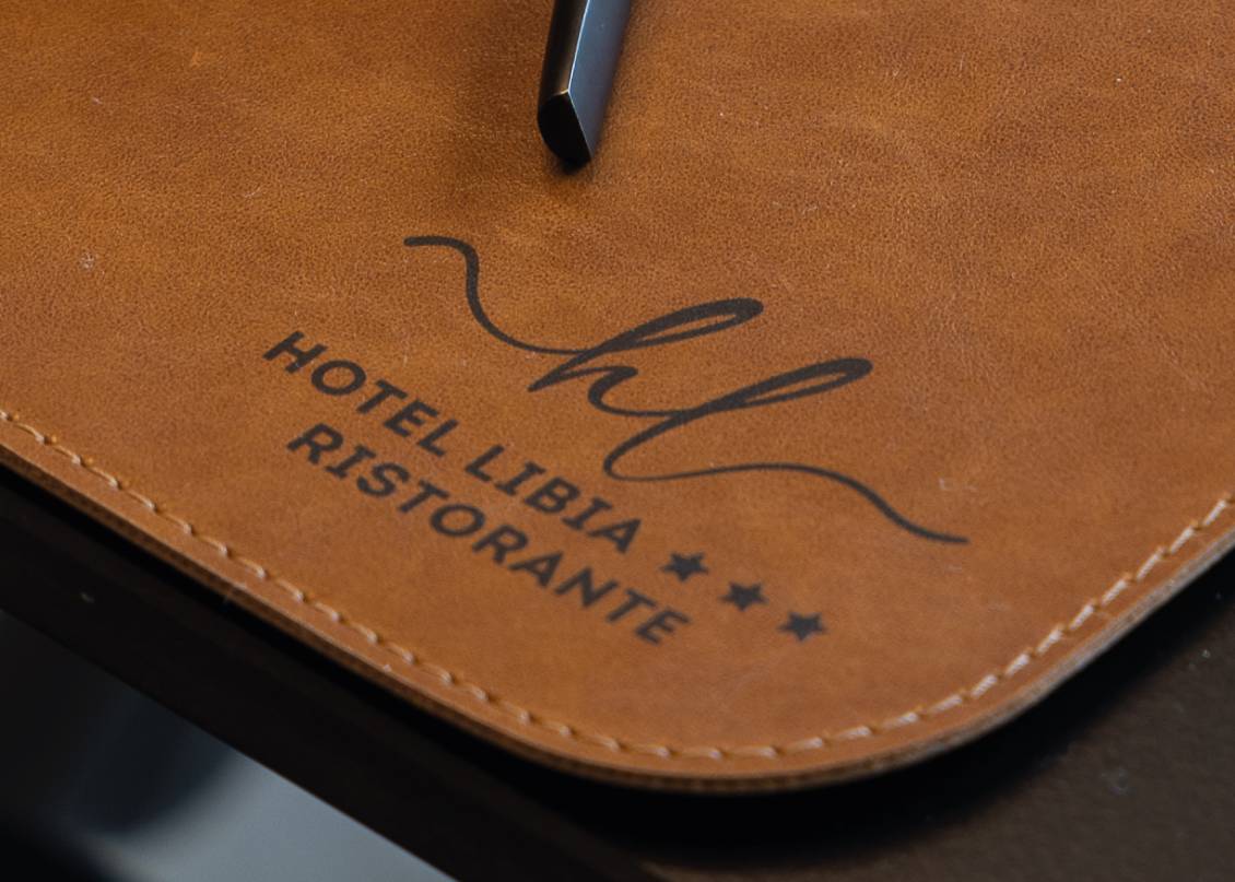
The new logo is characterized by a dynamic, fluid pictogram: a single line of variable thickness that draws the letters "h" and "l".For the logotype, a strong font was chosen, which contrasts the style of the pictogram, creating a modern but very elegant brand.Chromatically, only the institutional gold color has been maintained, still absolutely suitable for the hospitality market, while the burgundy has been replaced by a strong anthracite grey, very close to black.
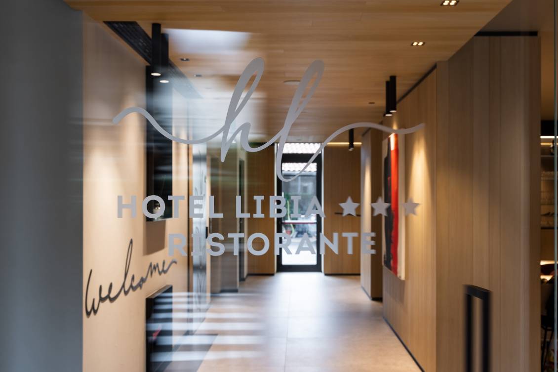
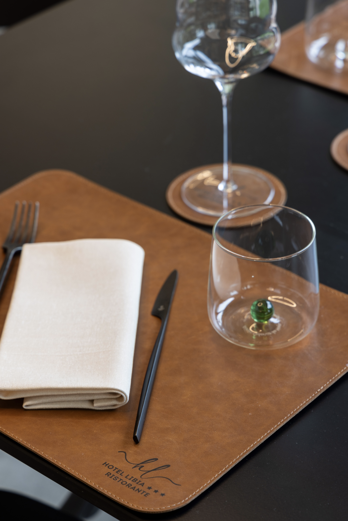
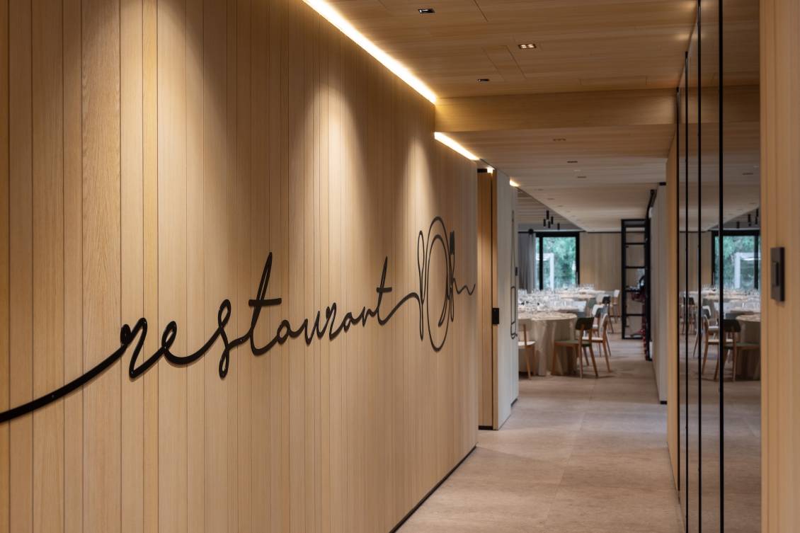
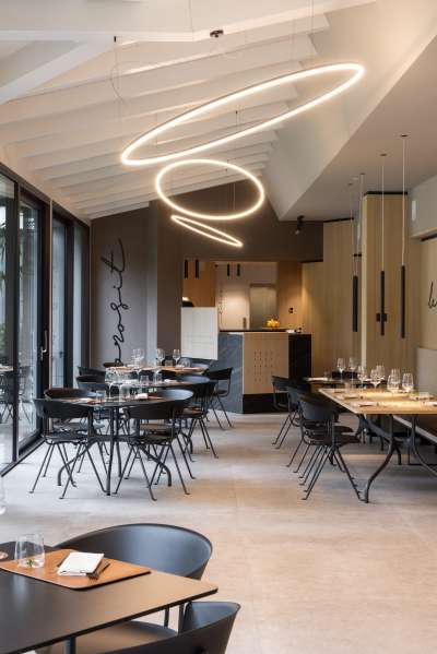
The hotel has undergone not only a graphic but also an architectural renovation (again by our studio). The new brand therefore fits perfectly with the colors of the materials used in the hotel's renovation and also with the iron sheet decorations that decorate many of the walls on the ground floor, made with the same graphic line as the pictogram.
Do you like the way we worked?
Make an appointment for a non-binding consultation now.
Schedule your consultation now!
BACK TO TOP
Hote Libia - logo restyling
CATEGORY: Graphics
YEAR: 2024
YEAR: 2024
The Hotel Libia in Fino del Monte has a long history to tell, which began in 1912. The hotel's logo was almost as old as the accommodation facility and therefore needed a radical restyling operation.
The historic brand was outdated and no longer in step with the times and modern uses. The logo font was difficult to read due to the decorations inside the letters and their shape, especially when used in small dimensions.
The new logo is characterized by a dynamic, fluid pictogram: a single line of variable thickness that draws the letters "h" and "l".
For the logotype, a strong font was chosen, which contrasts the style of the pictogram, creating a modern but very elegant brand.
Chromatically, only the institutional gold color has been maintained, still absolutely suitable for the hospitality market, while the burgundy has been replaced by a strong anthracite grey, very close to black.
The hotel has undergone not only a graphic but also an architectural renovation (again by our studio). The new brand therefore fits perfectly with the colors of the materials used in the hotel's renovation and also with the iron sheet decorations that decorate many of the walls on the ground floor, made with the same graphic line as the pictogram.
OTHER PROJECTS FOR THIS CLIENT
