|
Transparency
ITA | ENG |
"In good times, people want to advertise; in bad times, they have to."Bruce Barton
"In good times, people want to advertise; in bad times, they have to."
Bruce Barton
Presolana Ski - Logo design & Graphics
CATEGORY: Graphics
The brief of this project was to create the new logo of the ski resorts of the Presolana Pass, in the province of Bergamo.The logo had to have strictly to do with the territory, a splendid setting that surrounds the ski lifts, which accompanies every visitor who decides to enjoy a day of sport and fun.


The target audience Presolana Ski wants to address is a young target, kids who love skiing, snowboarding and skialp, but also families who want to bring the little ones to learn a new sport in complete safety or enjoy a nice snowshoe hike and a delicious lunch with products. typical.
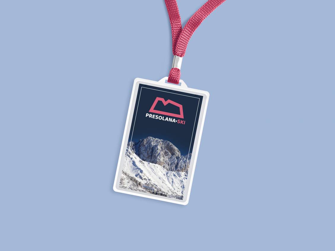
The pictogram of the logo was created by observing the Presolana massif, in all the majesty of its unmistakable silhouette. Stylized and brought to its most minimal version, the mountain profile becomes the symbol of Presolana Ski, transforming itself into a modern and easily recognizable brand.


And the color? Why didn't we use the range of blues or blues that immediately recall the world of cold and snow?The answer has always been the Presolana, and it does so at sunset. The pink color we have chosen derives directly from the wonderful color of the dolomite rock of the mountain at the last light of the evening.
Do you like the way we worked?
Make an appointment for a non-binding consultation now.
Schedule your consultation now!
BACK TO TOP
Presolana Ski - Logo design & Graphics
CATEGORY: Graphics
The brief of this project was to create the new logo of the ski resorts of the Presolana Pass, in the province of Bergamo.
The logo had to have strictly to do with the territory, a splendid setting that surrounds the ski lifts, which accompanies every visitor who decides to enjoy a day of sport and fun.
The target audience Presolana Ski wants to address is a young target, kids who love skiing, snowboarding and skialp, but also families who want to bring the little ones to learn a new sport in complete safety or enjoy a nice snowshoe hike and a delicious lunch with products. typical.
The pictogram of the logo was created by observing the Presolana massif, in all the majesty of its unmistakable silhouette. Stylized and brought to its most minimal version, the mountain profile becomes the symbol of Presolana Ski, transforming itself into a modern and easily recognizable brand.
And the color? Why didn't we use the range of blues or blues that immediately recall the world of cold and snow?
The answer has always been the Presolana, and it does so at sunset. The pink color we have chosen derives directly from the wonderful color of the dolomite rock of the mountain at the last light of the evening.
OTHER PROJECTS FOR THIS CLIENT
