|
Transparency
ITA | ENG |
"Simplicity, adequacy and proportion."Elsie de Wolfe
Elsie de Wolfe
Hotel Libia - ristrutturazione
CATEGORY: Interior design
LOCATION: Fino del Monte, BG
YEAR: 2024
The Hotel Libia in Fino del Monte, in the province of Bergamo, has a long history to tell.Awarded in October 2024 as a historic quality accommodation facility in the Bergamo Section, it boasts a very respectable foundation year: 1912.
After more than a century of activity, the owner Pamela felt a strong need to renovate the spaces of her structure, thus began our collaboration based on a continuous exchange with the client to satisfy every need, up to the realization of a truly ambitious project. The ground floor, the basement and the entire external garden area were the subject of a global revolution, for a total of approximately 1,200 square meters of internal renovation.
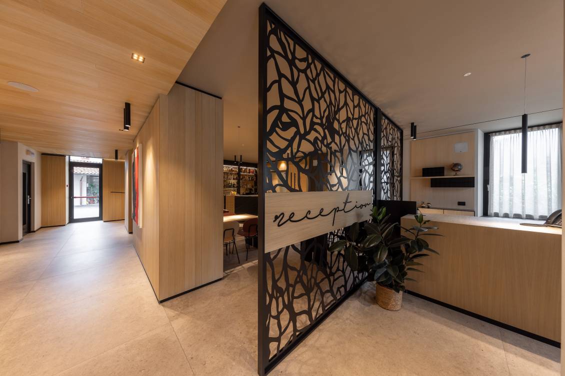
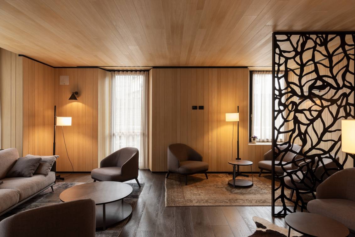
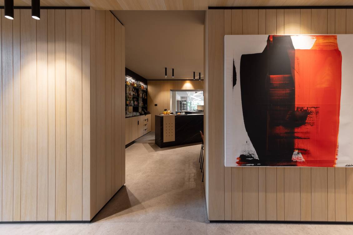
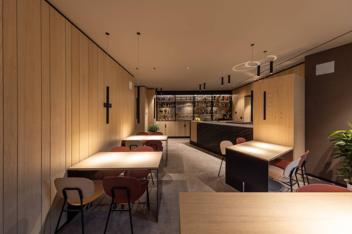
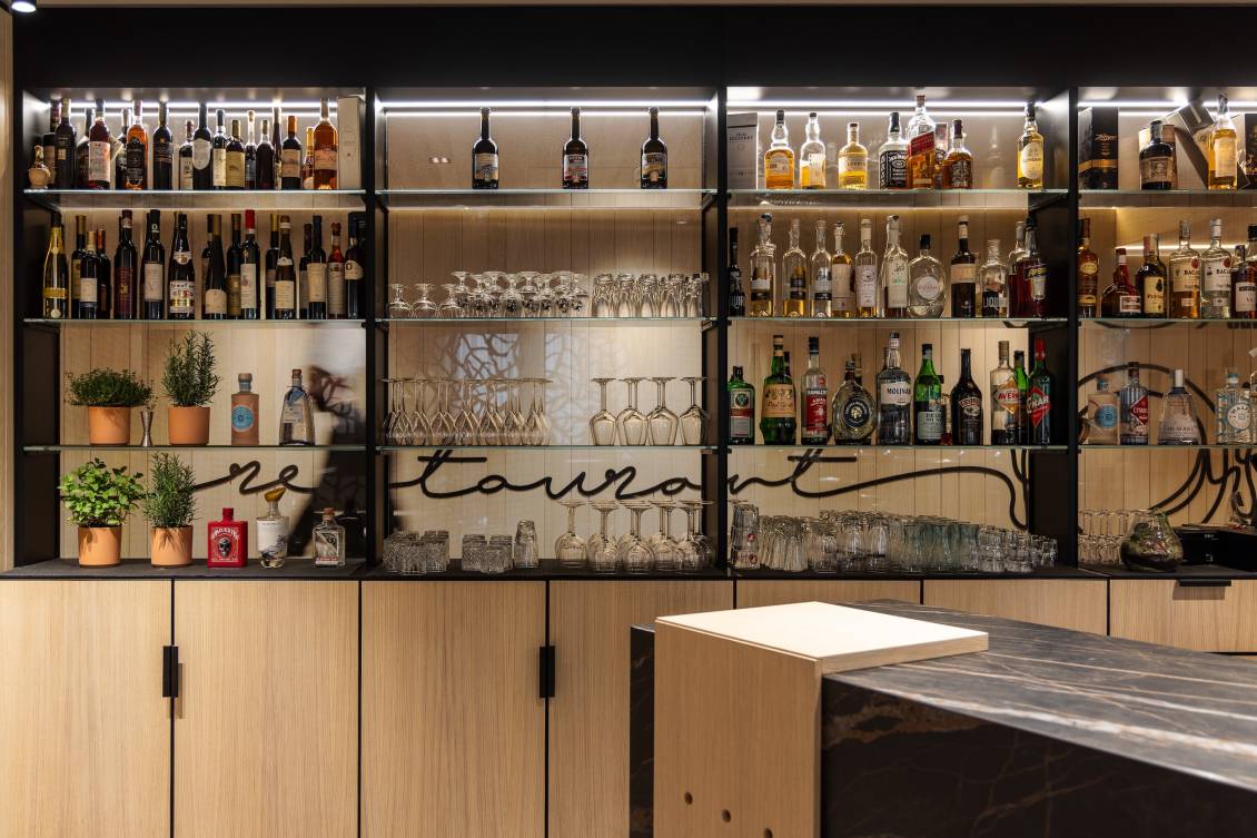
The light wood skin of shaded oak covers the walls of the entire ground floor, and together with the stone-effect porcelain stoneware floor laid in large-format tiles, they create an immediate continuity between the spaces. The entrance, located between the lounge area furnished with very comfortable upholstered furniture and lamps with warm and relaxing light and the reception, is bright and decorated with painted steel niches and a welcome sign that introduces the environment. The reception is a more intimate and private area, where hotel and bistro customers can be welcomed with the right privacy. From the black painted steel blade and perforated with laser engravings, made to our design, a first view of the bar area opens up. Here the protagonist is an imposing single-block counter in opaque stoneware, enriched with inserts of the same wood as the wall coverings. Next to it stands a mobile bar, made of wood and steel, characterized by a glass back decorated with micro-perforated film, which divides the bar area from the corridor that leads to the restaurant.
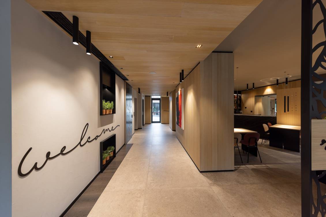
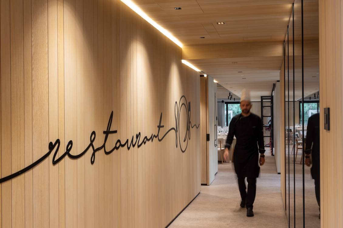
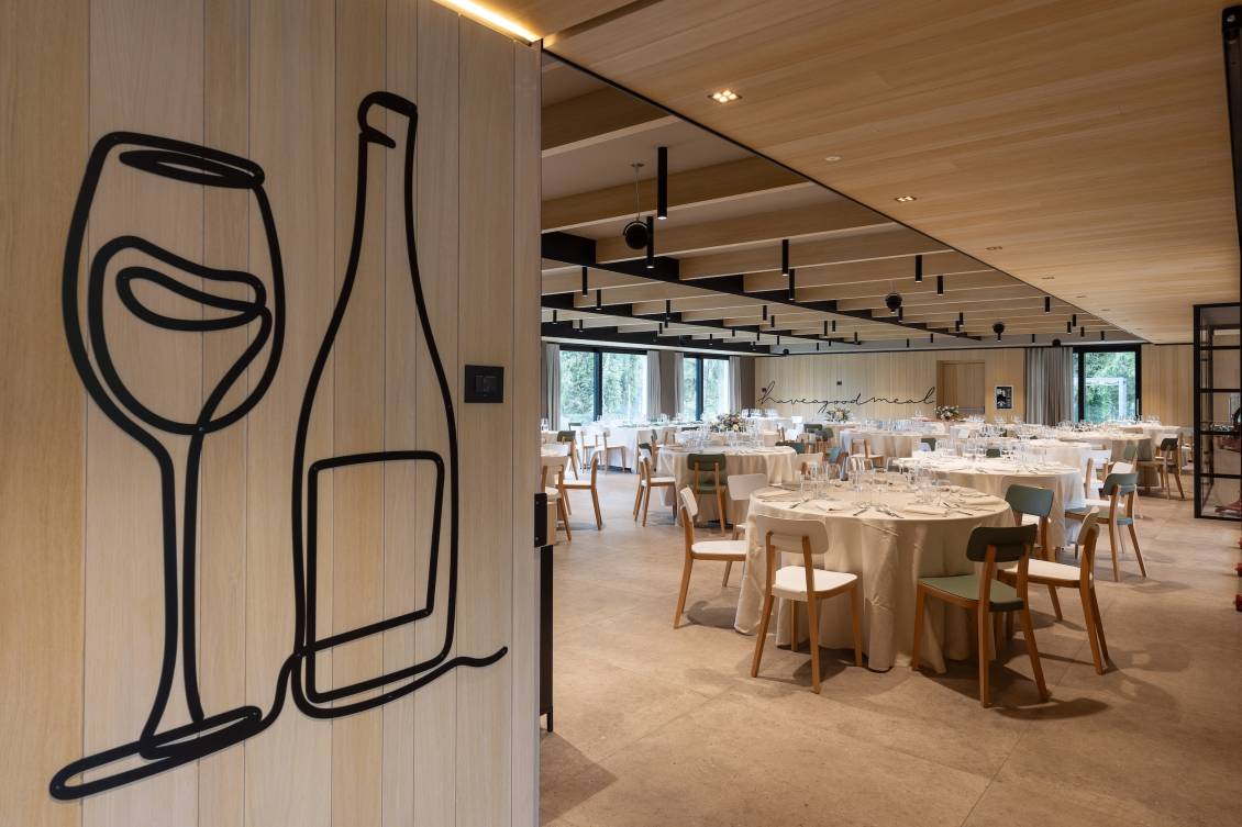
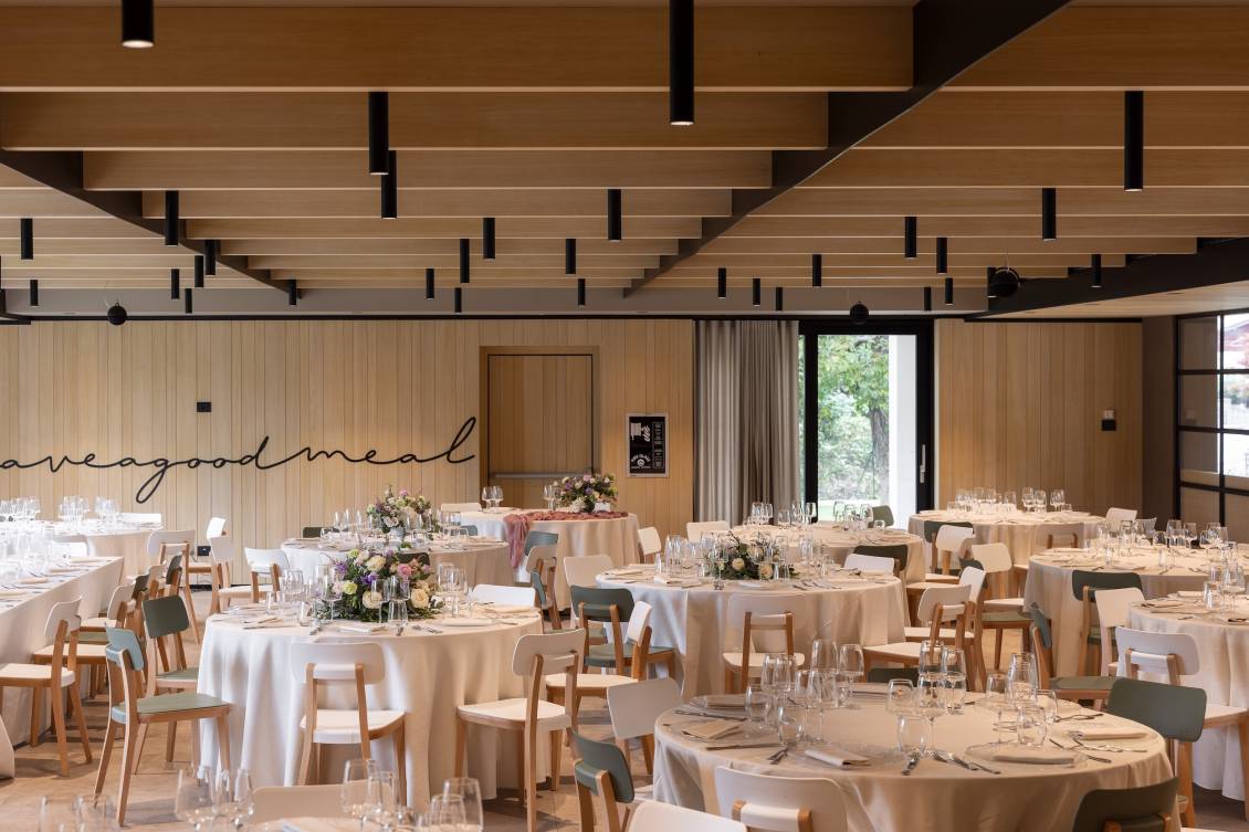
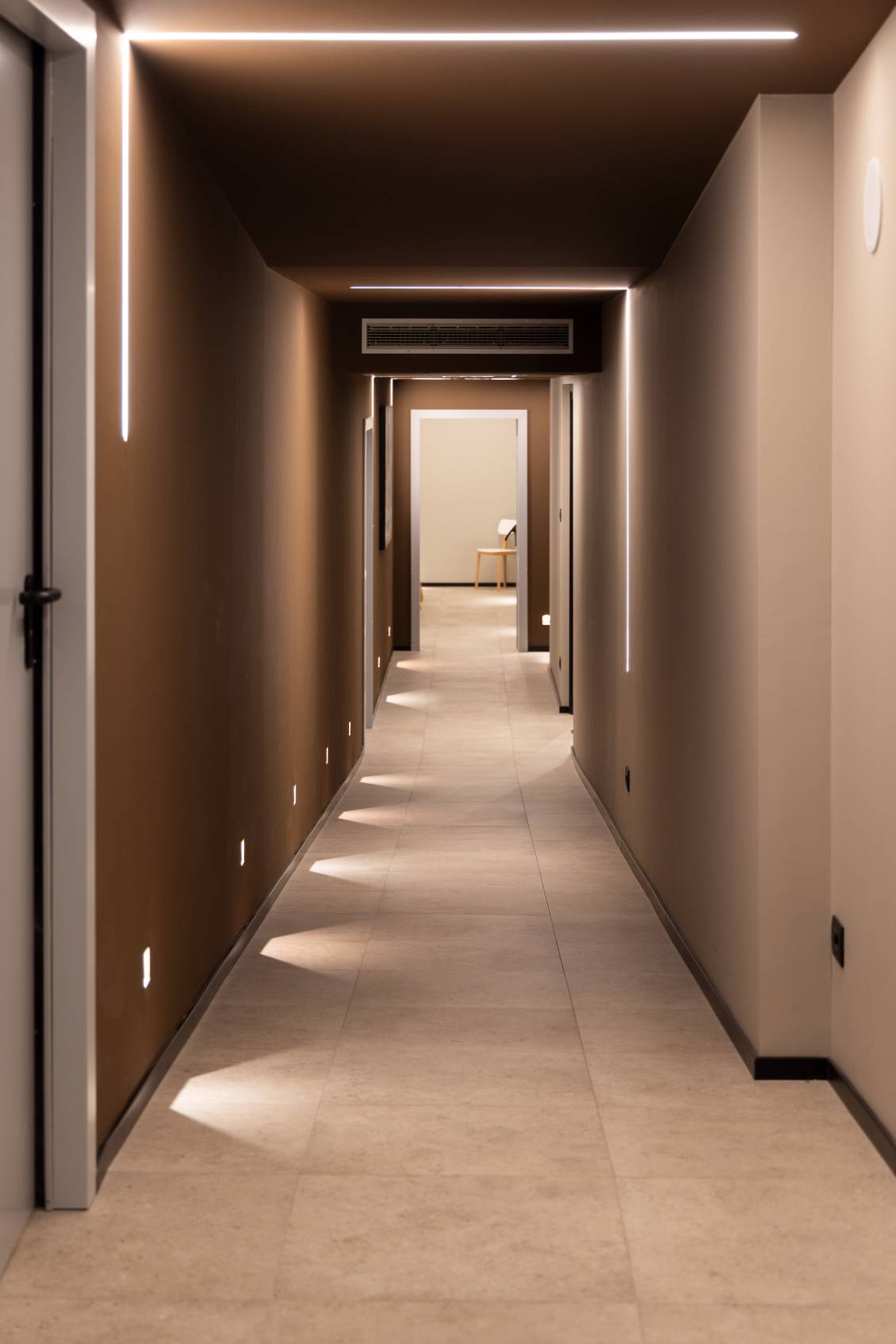
The corridor, intentionally kept long and bright, is a real walkway that introduces the visitor to the "food" area, making him discover it step by step. The wall of the corridor, like all those of the various areas, are decorated with thin iron blades that - coordinated with the style of the hotel logo (also designed by our studio in the graphic design department) - act as a common thread of the entire space making customers feel warmly welcomed. The restaurant, a location not only for lunches and dinners for hotel guests, but also a large reception room for events and private parties, is very bright, spacious and welcoming. The jewel in the crown of this dining room is certainly the ceiling, set up with wooden beams crossed by black painted steel blades. On the ceiling we also find small luminous cylinders equipped with a system for controlling the intensity and heat of the light. The walls are then characterized by custom furniture, designed and made ad hoc in wood and painted steel. The ergonomic and very comfortable seats were chosen in two colors (white and green) to enliven the space and make it even more dynamic.
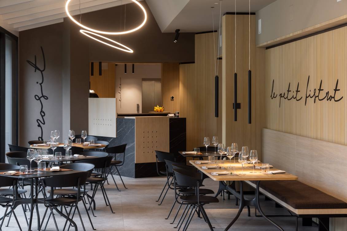
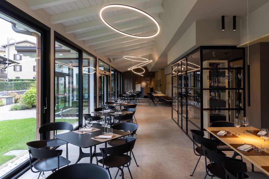
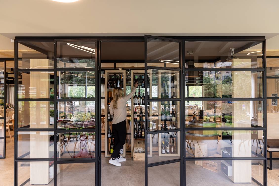
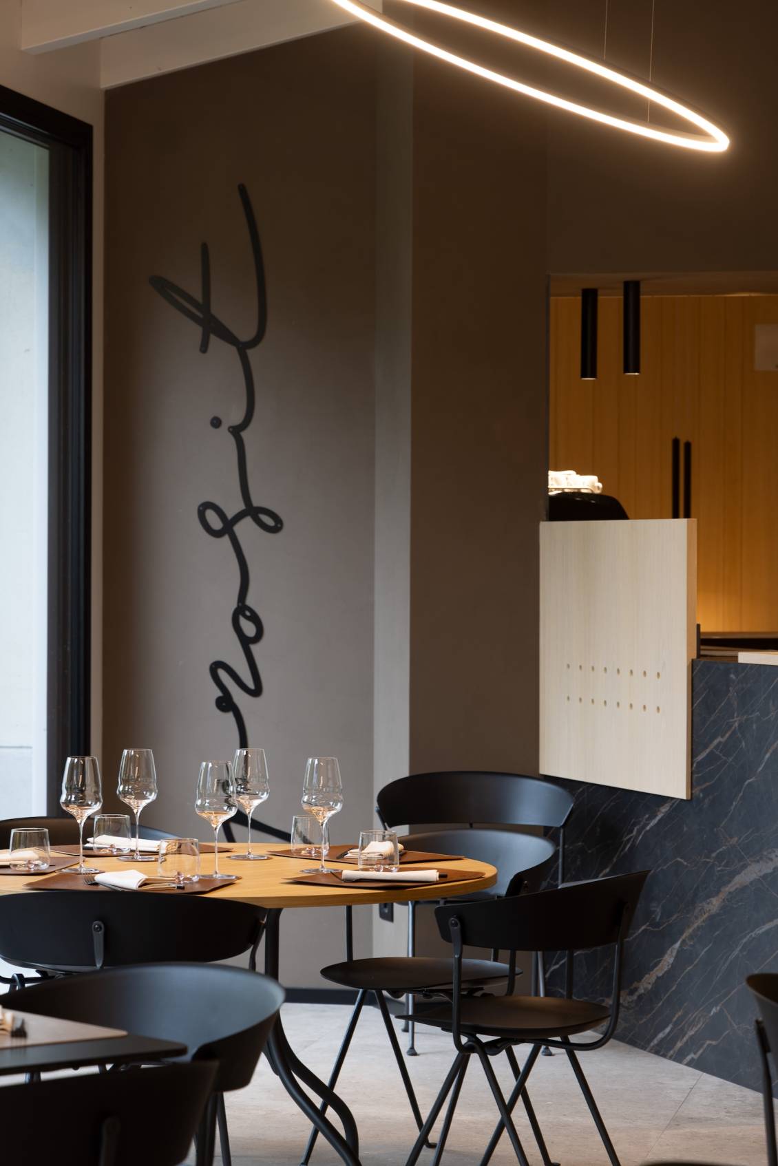
Next to the restaurant we find “le petit bistrot”. The previous veranda has been annexed to the rest of the spaces, eliminating the dividing wall that was between the restaurant and the current bistro, the old windows have been replaced with new black aluminum frames and the roof beams whitened and aligned chromatically with the rest of the project. The division between the two spaces has been maintained by a central glass window and a cellar made in a “treasure chest” style, with a black painted steel frame and glass, furnished with wood and steel storage.Tables and chairs, with a black iron structure, are perfectly aligned with the style of the environment and, together with the lighting that occurs through designer lamps, create a perfect atmosphere to enjoy a gourmet lunch or dinner.
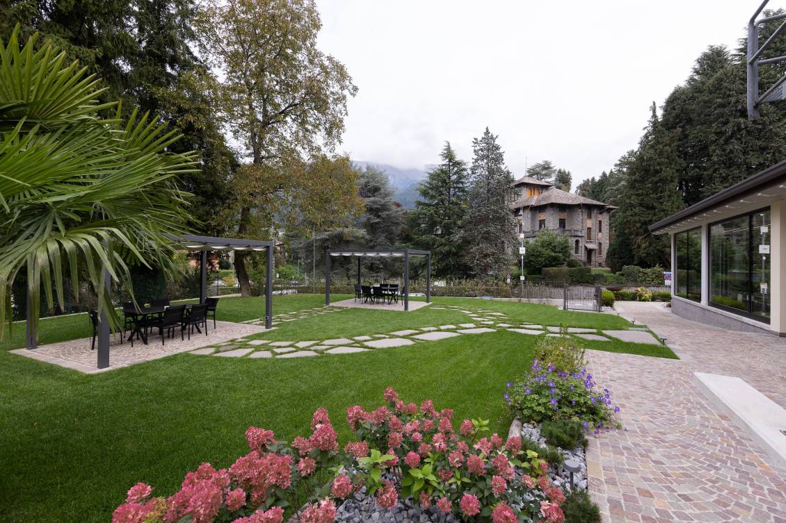
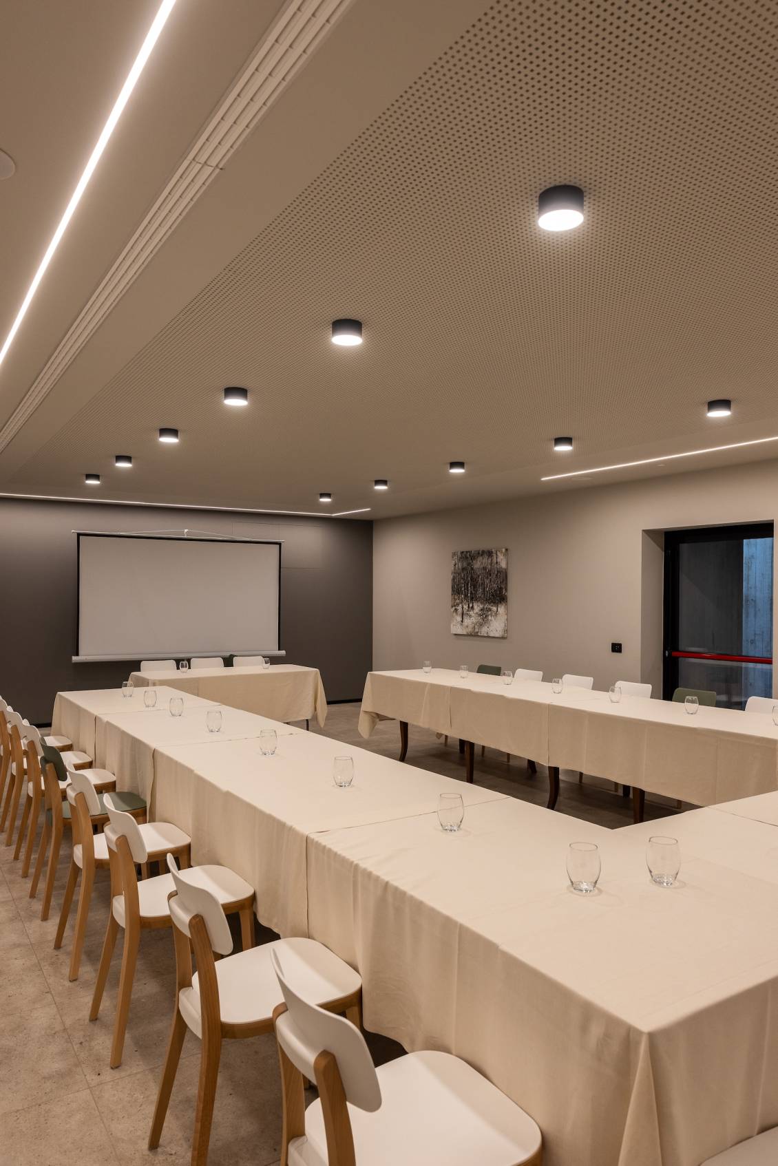
The garden area has also been renovated with a Garden design project and covered and furnished relaxation areas to enjoy the summer evenings to the fullest. In the basement, functional areas such as the children's room and the conference room have been created.
Do you like the way we worked?
Make an appointment for a non-binding consultation now.
Schedule your consultation now!
BACK TO TOP
Hotel Libia - ristrutturazione
CATEGORY: Interior design
LOCATION: Fino del Monte, BG
YEAR: 2024
LOCATION: Fino del Monte, BG
YEAR: 2024
The Hotel Libia in Fino del Monte, in the province of Bergamo, has a long history to tell.
Awarded in October 2024 as a historic quality accommodation facility in the Bergamo Section, it boasts a very respectable foundation year: 1912.
After more than a century of activity, the owner Pamela felt a strong need to renovate the spaces of her structure, thus began our collaboration based on a continuous exchange with the client to satisfy every need, up to the realization of a truly ambitious project. The ground floor, the basement and the entire external garden area were the subject of a global revolution, for a total of approximately 1,200 square meters of internal renovation.
The light wood skin of shaded oak covers the walls of the entire ground floor, and together with the stone-effect porcelain stoneware floor laid in large-format tiles, they create an immediate continuity between the spaces. The entrance, located between the lounge area furnished with very comfortable upholstered furniture and lamps with warm and relaxing light and the reception, is bright and decorated with painted steel niches and a welcome sign that introduces the environment. The reception is a more intimate and private area, where hotel and bistro customers can be welcomed with the right privacy. From the black painted steel blade and perforated with laser engravings, made to our design, a first view of the bar area opens up. Here the protagonist is an imposing single-block counter in opaque stoneware, enriched with inserts of the same wood as the wall coverings. Next to it stands a mobile bar, made of wood and steel, characterized by a glass back decorated with micro-perforated film, which divides the bar area from the corridor that leads to the restaurant.
The corridor, intentionally kept long and bright, is a real walkway that introduces the visitor to the "food" area, making him discover it step by step. The wall of the corridor, like all those of the various areas, are decorated with thin iron blades that - coordinated with the style of the hotel logo (also designed by our studio in the graphic design department) - act as a common thread of the entire space making customers feel warmly welcomed.
The restaurant, a location not only for lunches and dinners for hotel guests, but also a large reception room for events and private parties, is very bright, spacious and welcoming. The jewel in the crown of this dining room is certainly the ceiling, set up with wooden beams crossed by black painted steel blades. On the ceiling we also find small luminous cylinders equipped with a system for controlling the intensity and heat of the light. The walls are then characterized by custom furniture, designed and made ad hoc in wood and painted steel. The ergonomic and very comfortable seats were chosen in two colors (white and green) to enliven the space and make it even more dynamic.
Next to the restaurant we find “le petit bistrot”. The previous veranda has been annexed to the rest of the spaces, eliminating the dividing wall that was between the restaurant and the current bistro, the old windows have been replaced with new black aluminum frames and the roof beams whitened and aligned chromatically with the rest of the project. The division between the two spaces has been maintained by a central glass window and a cellar made in a “treasure chest” style, with a black painted steel frame and glass, furnished with wood and steel storage.
Tables and chairs, with a black iron structure, are perfectly aligned with the style of the environment and, together with the lighting that occurs through designer lamps, create a perfect atmosphere to enjoy a gourmet lunch or dinner.
The garden area has also been renovated with a Garden design project and covered and furnished relaxation areas to enjoy the summer evenings to the fullest. In the basement, functional areas such as the children's room and the conference room have been created.
OTHER PROJECTS FOR THIS CLIENT

